|
Candy colored tones for spring
With spring approaching rapidly, we can’t help but feel happy. The season is known as a time of rebirth, renewal and rejuvenation. A time we desperately need right now. In response to the pandemic we started developing a longing for comfort and wellness, and that’s where the, spring-favorite, pastel shades enter the conversation.
Pastels are colors that hold the power to make us feel calm and that can be associated with wellness. It’s said that the reasoning behind this is that these colors remind us of our childhood. These uncertain times make us crave security and comfort, and those nostalgic feelings of pastel bedrooms and children’s clothing do just the trick. In fashion, these less saturated hues have been used since the 18th century. This spring season designers have turned to pastels as mood enhancers. Above all this, pastel hues are easy to combine with neutrals, earth tones, dark colors, black and white – even your basic denim gets an upgrade paired with a pastel top or jacket.
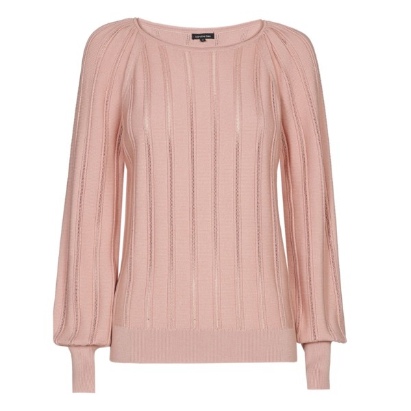
Pastel pink
Doesn’t everyone want to remind others of cotton candy all the time? Feminine and soft tones like baby pink and salmon are sure to make you feel as sweet as you look.
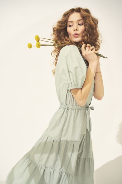
Pastel green
Looking for a more unique pastel hue? Minty or pistachio greens are a perfect way to refresh your wardrobe.
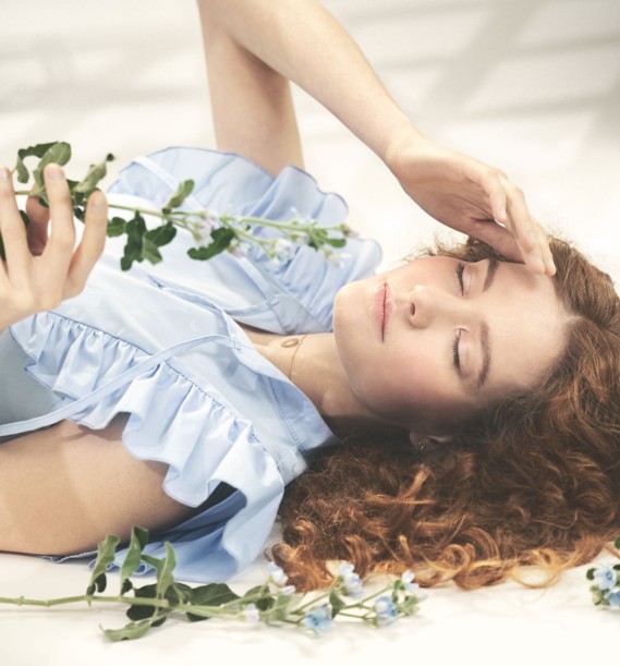
Pastel blue
Blue is a relatively easy color to wear. The less saturated hues like baby blue and sky blue remind us of the outdoors, a sight that has been much missed in 2020.
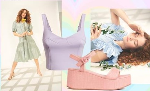
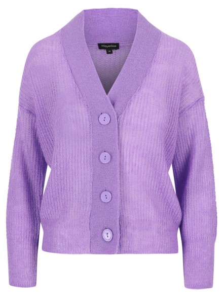
Pastel purple
Lilac, lavender, violet, … you name it. These fresh, feminine and subtly romantic hues are universally flattering. So channel your inner Prince and bathe in the lilac rain.
|


